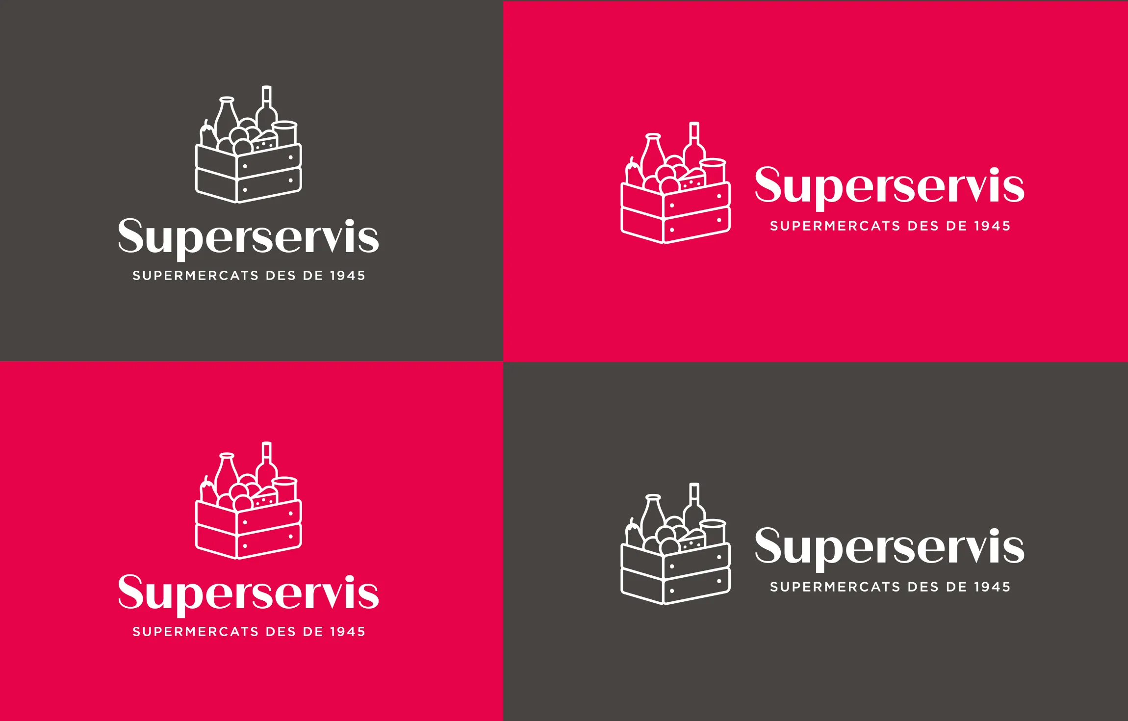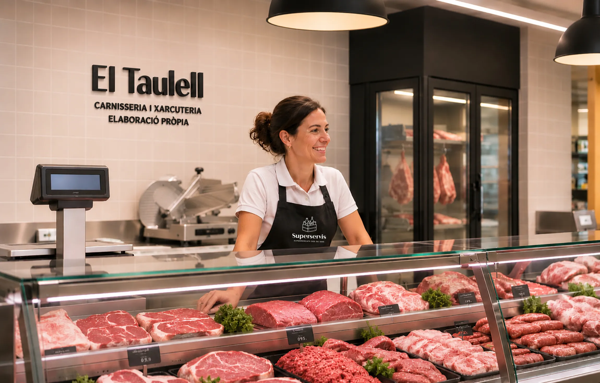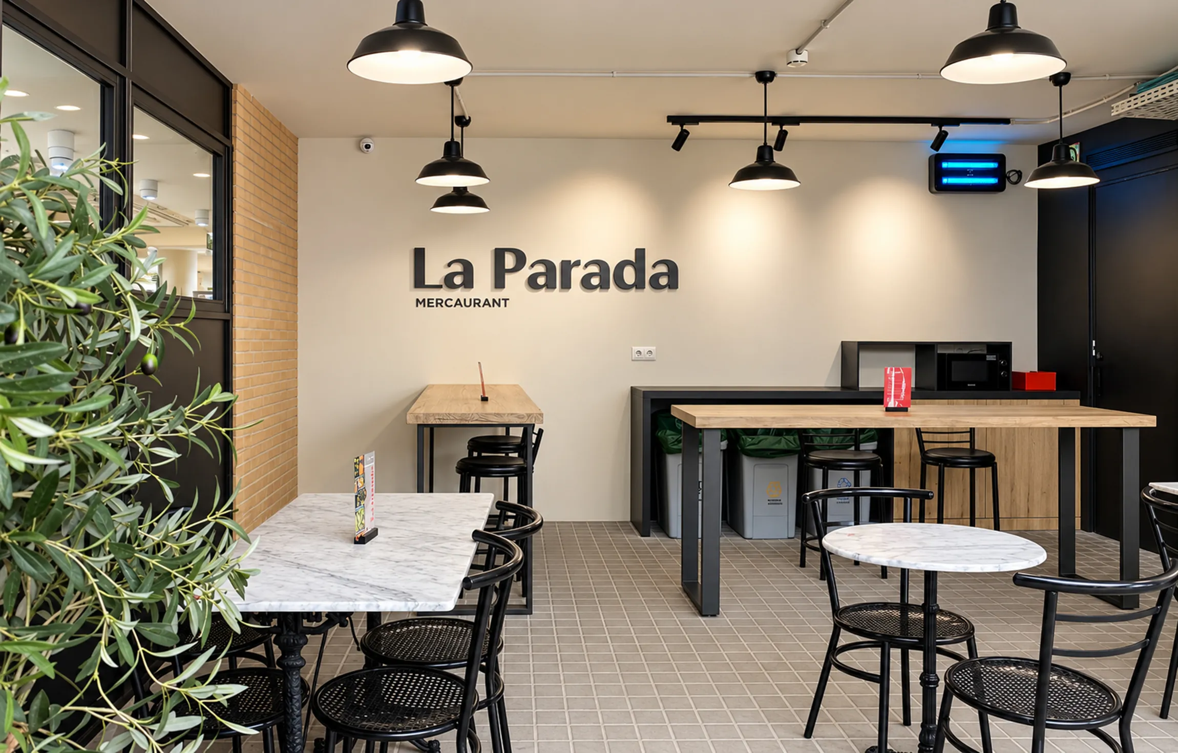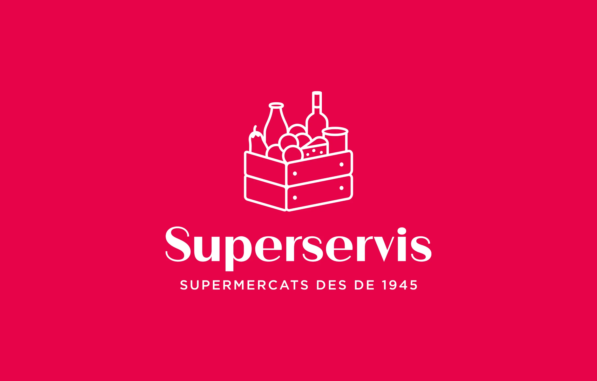
Founded in 1945, the supermarket group has a long-standing heritage shaped by family tradition, in-depth product knowledge and close relationships with its customers. More than eight decades later, the arrival of a new partner, changing shopping habits and customer needs, and the chain's expansion plans called for a redesign its identity.
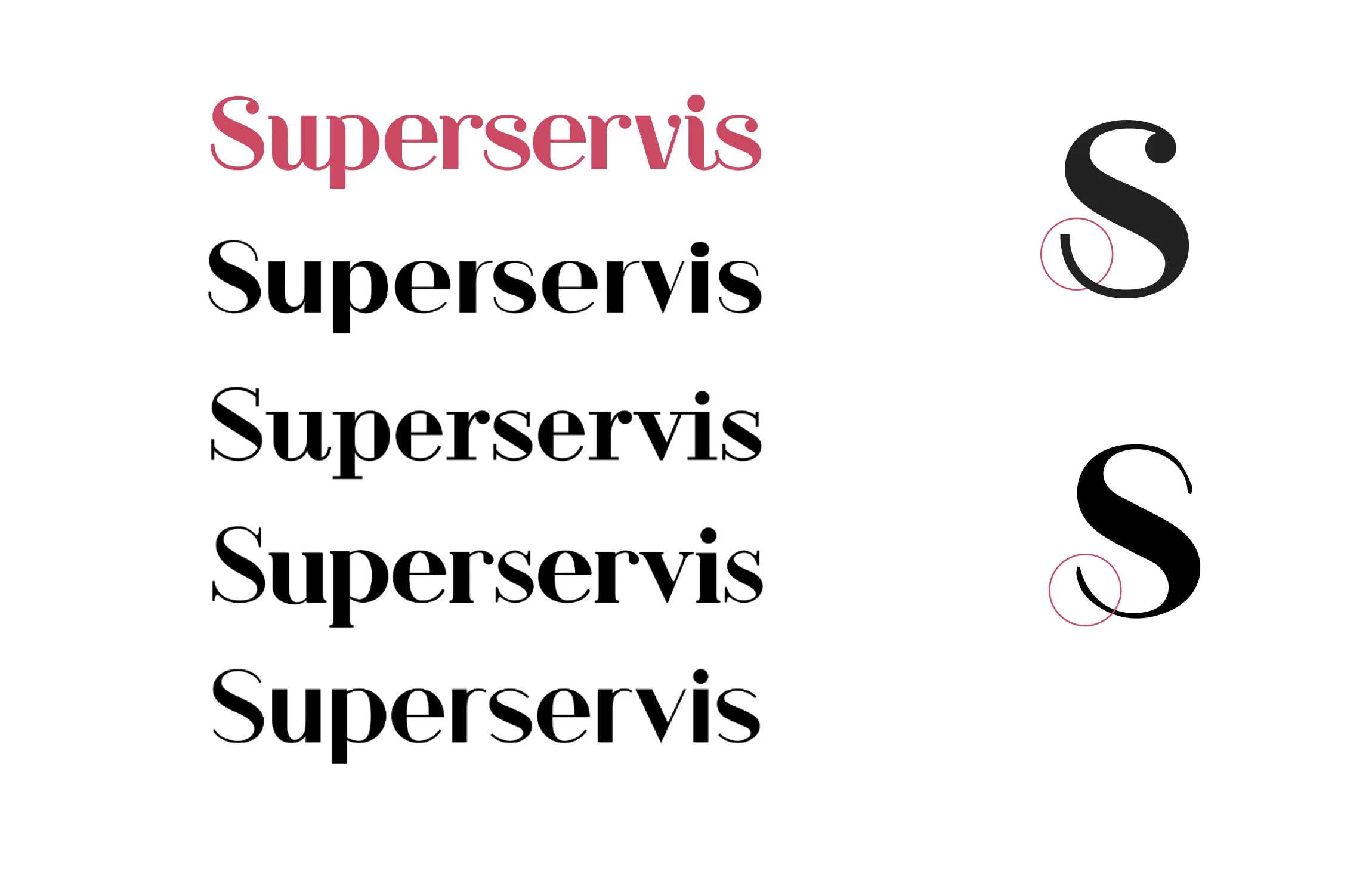
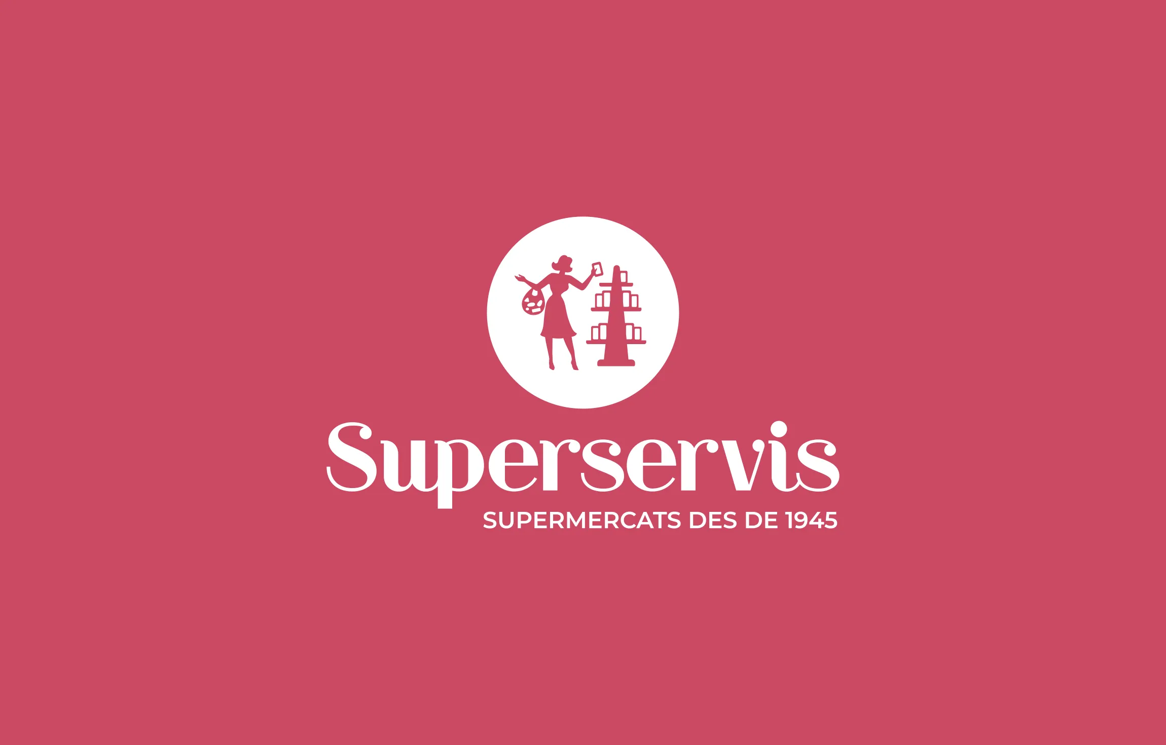
The project set out to update an outdated logo while retaining its original typeface as a link to the brand's heritage. The letterforms were refined, with thicker strokes to improve legibility at smaller sizes and simplified terminals to create a cleaner, more contemporary expression.
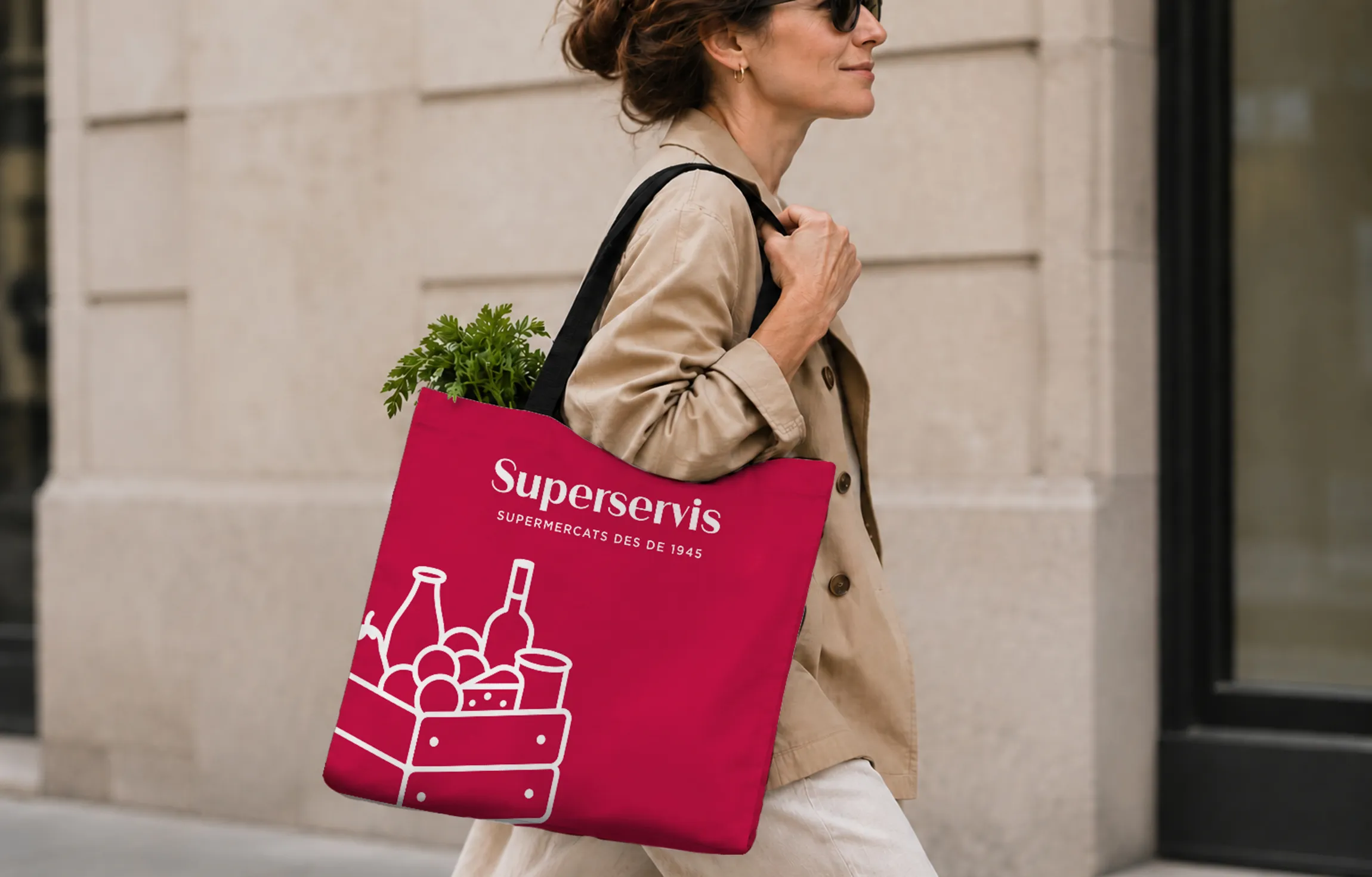
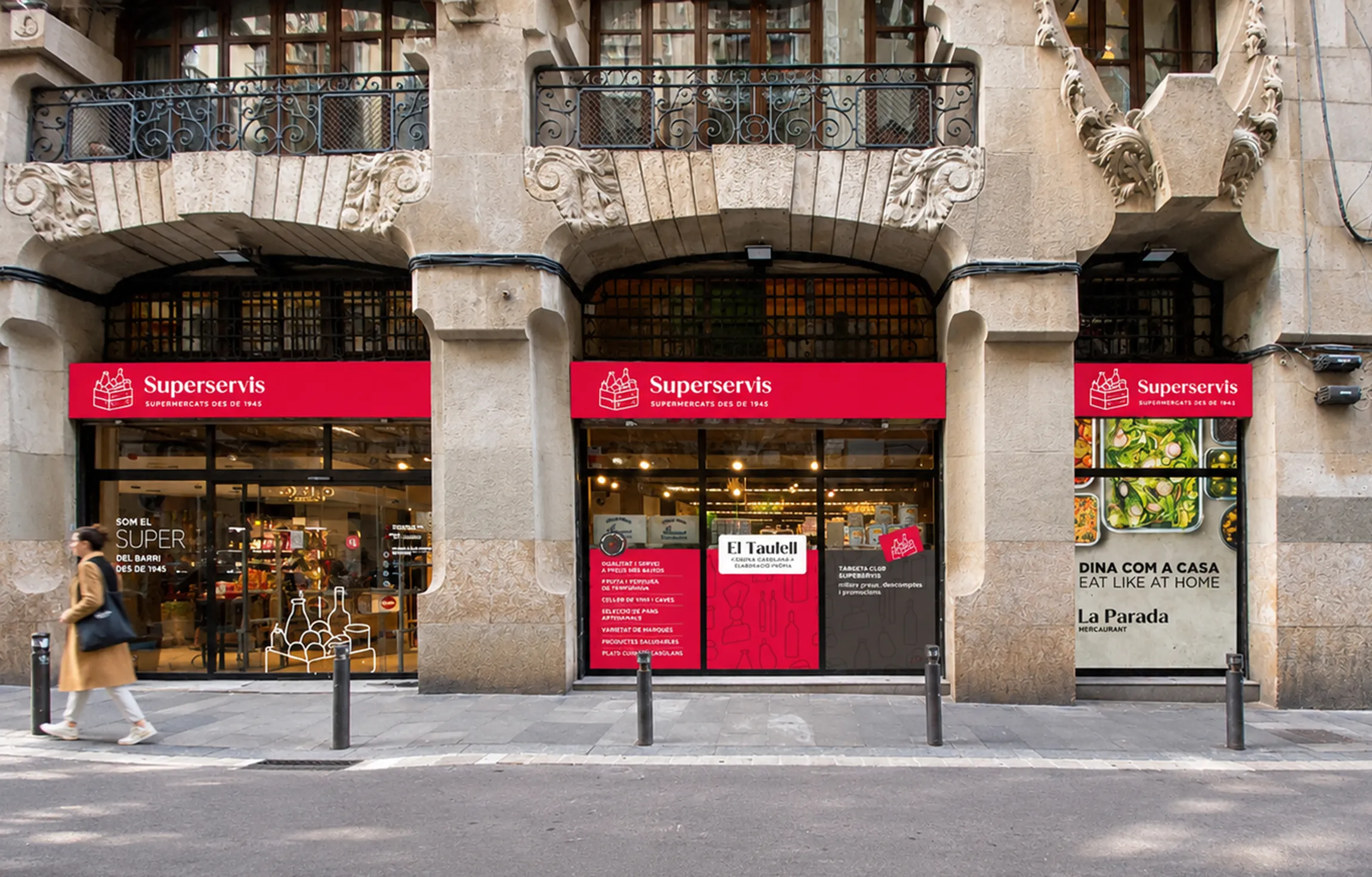
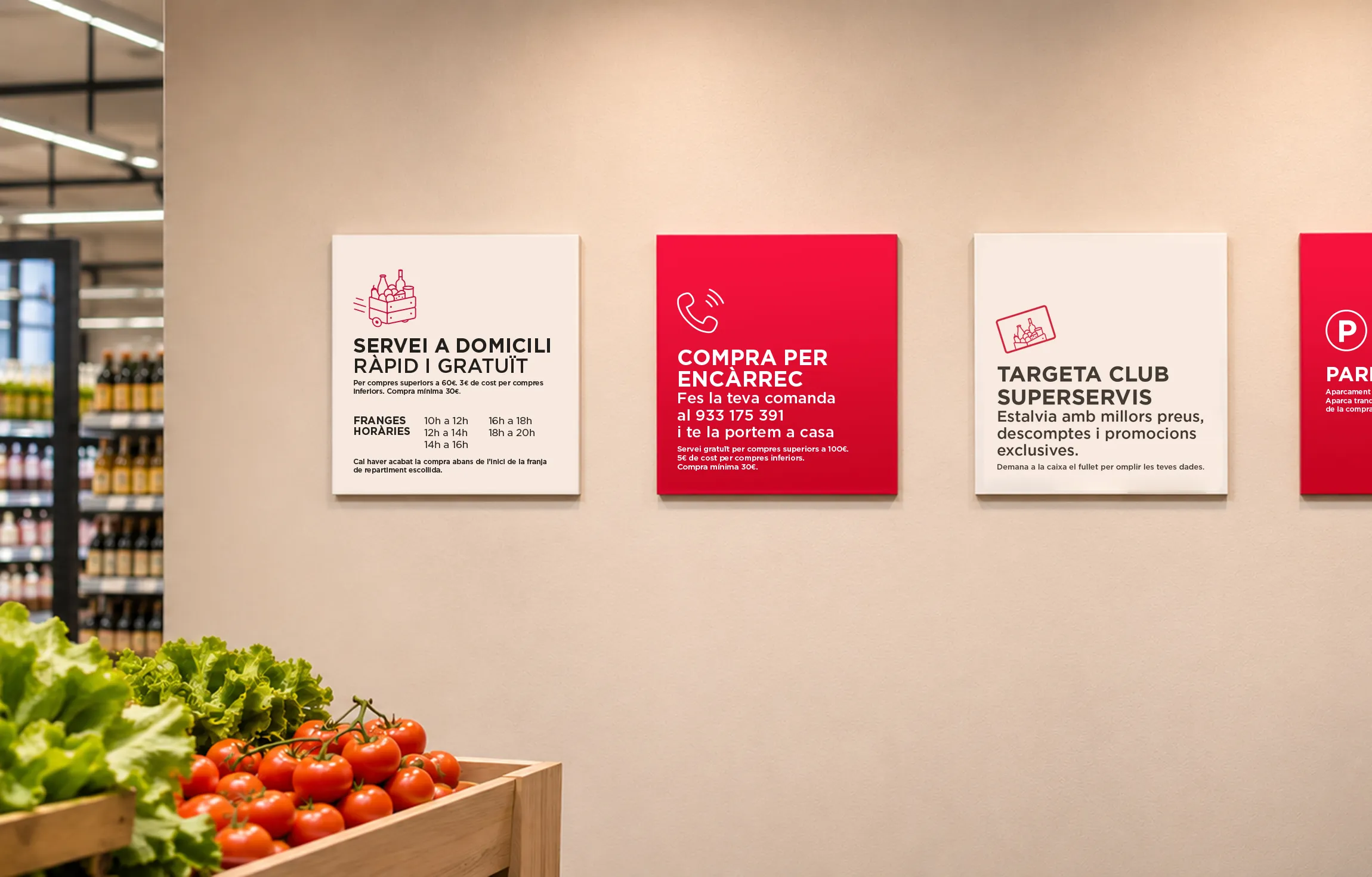
The result is an identity that connects the brand's heritage with its future, preserving the qualities that have always defined it: family tradition, product knowledge, local presence and personalised service. A more contemporary and confident brand, ready to grow and adapt to new formats and retail locations.