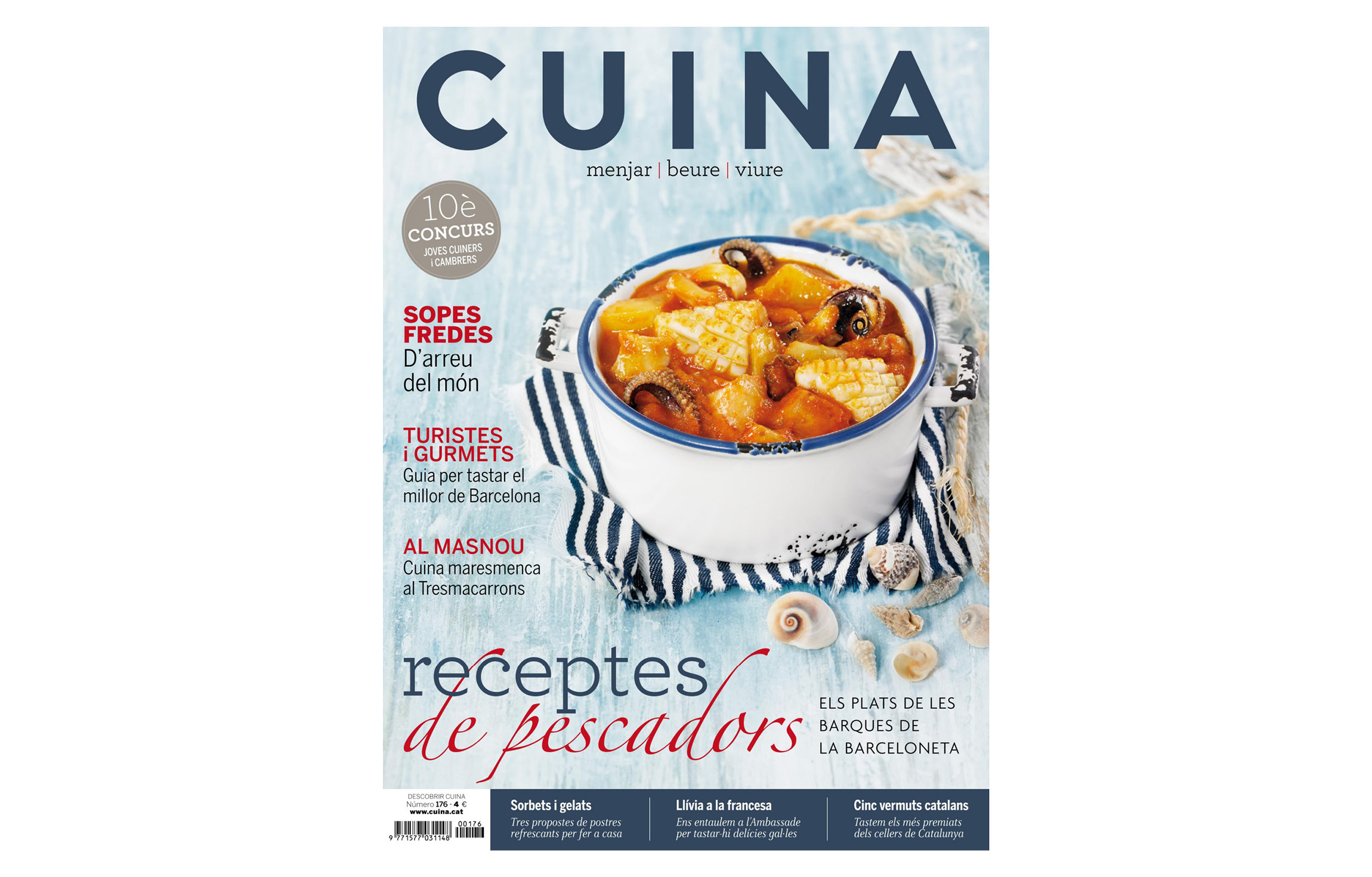
Based on our Arboria typeface, the masthead of the Cuina magazine brings together the characteristics that the client asked about clarity and readability (on covers that are usually full of information) and is part of the editorial advice we provide for the publication.
